Charts
Published:
This post covers Introduction to probability from Statistics for Engineers and Scientists by William Navidi.
Basic Ideas
Charts
Statistical Quality Control
Control charts enable the quality engineer to decide whether a process appears to
be in control, or whether one or more special causes are present.
If the process is found to be out of control, the nature of the special cause must be determined and corrected, so as to return the process to a state of statistical control.
Machines that are malfunctioning, operator error, fluctuations in ambient conditions, and variations in the properties of raw materials are among the most common of these factors.
These are called special causes or assignable causes. Special causes generally produce a higher level of variability than do common causes; this variability is considered to be unacceptable. When a process is operating in the presence of one or more special causes, it is said to be out of statistical control.
There are several types of control charts; which ones are used depend on whether the quality characteristic being measured is a continuous variable, a binary variable, or a count variable
Collecting Data—Rational Subgroups
Data to be used in the construction of a control chart are collected in a number of samples, taken over a period of time. These samples are called rational subgroups
Sample at regular time intervals, with all the items in each sample manufactured
near the time the sampling is done.
- Sample at regular time intervals, with the items in each sample drawn from all the
units produced since the last sample was taken.
- For binary and for count data, samples must in general be larger.
Control versus Capability
- A process is in control if there are no special causes operating.
- The distinguishing feature of a process that is in control is that the values of the quality characteristic vary without any trend or pattern, since the common causes do not change over time.
- The ability of a process to produce output that meets a given specification is called the capability of the process
Process Control Must Be Done Continually
- a process that is in control and capable at a given time may go out of control at a later time, as special causes re-occur. For this reason processes must be continually monitored.
Similarities Between Control Charts and Hypothesis Tests
- If the evidence against the null hypothesis is sufficiently strong, the process is declared out of control
- Understanding how to use control charts involves knowing what data to collect and knowing how to organize those data to measure the strength of the evidence against the hypothesis that the process is in control.
Control Charts for Variables
- The idea behind control charts is that each value of $\overline X$ approximates the process mean during the time its sample was taken, while the values of $R$ and $s$ can be used to approximate the process standard deviation.
- If the process is in control, then the process mean and standard deviation are the same for each sample. If the process is out of control, the process mean $\mu$ or the process standard deviation $\sigma$, or both, will differ from sample to sample
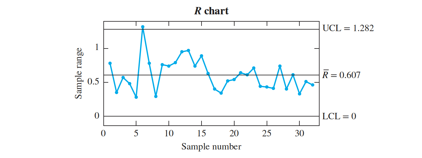
- The horizontal axis represents the samples, numbered from 1 to 32.
- The sample ranges are plotted on the vertical axis. Most important are the three horizontal lines. The line in the center is plotted at the value R and is called the center line.
- The upper and lower lines indicate the $3\sigma$ upper and $3\sigma$ lower control limits (UCL and LCL, respectively).
- The control limits are drawn so that when the process is in control, almost all the points will lie within the limits.
- A point plotting outside the control limits is evidence that the process is out of control.
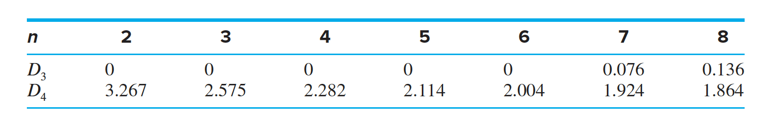
- Assume that the $n$ sample ranges come from a population with mean $\mu_R$ and standard deviation $\sigma_R$. The values of $\mu_R$ and $\sigma_R$ will not be known exactly, but it is known that for most populations, it is unusual to observe a value that differs from the mean by more than three standard deviations.
- For this reason, it is conventional to plot the control limits at points that approximate the values $𝜇_R \pm 3\sigma$.
- It can be shown by advanced methods that the quantities $𝜇_R \pm 3\sigma_R$ can be estimated with multiples of $ \overline R$; these multiples are denoted $D_3$ and $D_4$.
- The quantity $\mu_R − 3\sigma_R$ is estimated with $D_{3} \overline R$, and the quantity $\mu_R + 3 \sigma_R$ is estimated with $D_4 \overline R$. The quantities $D_3$ and $D_4$ are constants whose values depend on the sample size $n$. A brief table of values of $D_3$ and $D_4$ follows.
Compute the $3𝜎 R$ chart upper and lower control limits for the moisture data in Table Data.
- Figure R Chart shows that the range for sample number 6 is above the upper control limit

We delete sample $6$ from the data and recompute the R chart. The results are shown in Figure. The process variation is now in control.
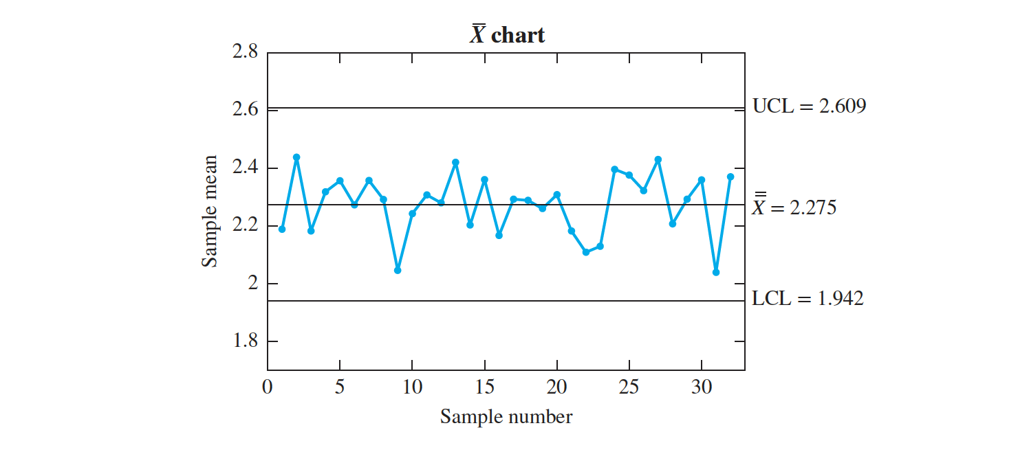
we can assess whether the process mean is in control by plotting the $\overline X$ chart
The $\overline X$ chart Chart constants
- To compute the center line and the control limits, we can assume that the process standard deviation is the same for all samples, since the $R$ chart has been used to bring the process variation into control.
- If the process mean $\mu $ is in control as well, then it too is the same for all samples. In that case the $32$ sample means are drawn from a normal population with mean $\mu_X = \mu$ and standard deviation $\sigma_X = \sigma ∕\sqrt n$, where $n$ is the sample size, equal to $5$ in this case. Ideally, we would like to plot the center line at $\mu$ and the $3\sigma$ control limits at $𝜇 \pm 3\sigma_X$.
- However, the values of $\mu$ and $\sigma_X$ are usually unknown and have to be estimated from the data. We estimate $\mu$ with $ \overline X$, the average of the sample means. The center line is therefore plotted at $\overline X$. The quantity $\sigma_X$ can be estimated by using either the average range $R$ or by using the sample standard deviations

The sample means are plotted on the vertical axis.
The $\overline X$ chart has a center line and upper and lower control limits.

In an $ \overline X$ chart, when $ \overline R$ is used to estimate $\sigma_X$, the center line and the $3 \sigma$ upper and lower control limits are given by
$3 \sigma $ upper limit = $ \overline {\overline X} + A_2 \overline R$
Center line = $ \overline {\overline X}$
$3 \sigma $ lower limit = $ \overline {\overline X }− A_2 \overline R$
The value $A_2$ depends on the sample size.
Compute the $3 \sigma \overline X$ chart upper and lower control limits for the given moisture data
The $\overline X$ chart clearly shows that the process mean is not in control, as there are several points plotting outside the control limits.
The production manager installs a hygrometer to monitor the ambient humidity and determines that the fluctuations in moisture content are caused by fluctuations in ambient humidity.
A dehumidifier is installed to stabilize the ambient humidity. After this special cause is remedied, more data are collected, and a new R chart and X chart are constructed.
After this special cause is remedied, more data are collected, and a new $R$ chart and $ \overline X$ chart are constructed
The process is nowin a state of statistical control. Of course, the process must be continually monitored, since new special causes are bound to crop up from time to time and will need to be detected and corrected.
Control Chart Performance There is a close connection between control charts and hypothesis tests. The null hypothesis is that the process is in a state of control.
- A point plotting outside the 3𝜎 control limits presents evidence against the null hypothesis.
- As with any hypothesis test, it is possible to make an error. For example, a point will occasionally plot outside the 3𝜎 limits even when the process is in control. This is called a false alarm.
- It can also happen that a process that is not in control may not exhibit any points outside the control limits, especially if it is not observed for a long enough time. This is called a failure to detect.
- It is desirable for these errors to occur as infrequently as possible. We describe the frequency with which these errors occur with a quantity called the average run length (ARL).
- The ARL is the number of samples that must be observed, on average, before a point plots outside the control limits. We. would like the ARL to be large when the process is in control, and small when the process is out of control.
- We can compute the $ARL$ for an $ \overline X$ chart if we assume that process mean $\mu$ and the process standard deviation $\sigma$ are known. Then the center line is located at the process mean $\mu$ and the control limits are at $ \mu \pm 3\sigma_{ \overline X}$.
- We must also assume, as is always the case with the $ \overline X$ chart, that the quantity being measured is approximately normally distributed.
The average run length (ARL) is the number of samples that will be observed, on the average, before a point plots outside the control limits. If p is the probability that any given point plots outside the control limits, then
$ARL = \frac{1}{p}$
- If a process is out of control, the ARL will be less than $\frac{1}{p}$
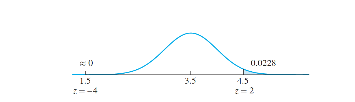
A process has mean $𝜇 = 3$ and standard deviation $𝜎 = 1$. Samples of size $n = 4$ are taken. If a special cause shifts the process mean to a value of $3.5$, find the $ARL$.
The Western Electric Rules
Any one of the following conditions is evidence that a process is out of control:
Any point plotting outside the 3𝜎 control limits.
- Two out of three consecutive points plotting above the upper 2𝜎 limit, or
- two out of three consecutive points plotting below the lower 2𝜎 limit.
- Four out of five consecutive points plotting above the upper 1𝜎 limit, or
- four out of five consecutive points plotting below the lower 1𝜎 limit.
- Eight consecutive points plotting on the same side of the center line.
The S chart
The S chart is an alternative to the R chart.
Both the S chart and the R chart are used to control the variability in a process.
While the R chart assesses variability with the sample range, the S chart uses the sample standard deviation.
In an S chart, the center line and the $3 \sigma$ upper and lower control limits are given by
$3𝜎 $upper limit = $B_4 \overline s$ Center line = $ \overline s$ $3\sigma$lower limit = $B_3 \overline s$
The values $B_3$ and $B_4$ depend on the sample size.

- The S chart in Figure shows that the process variation is out of control in sample 6. We delete this sample and recompute the S chart. Below figure presents the results. The variation is now in control. Note that this S chart is similar in appearance to the R chart.
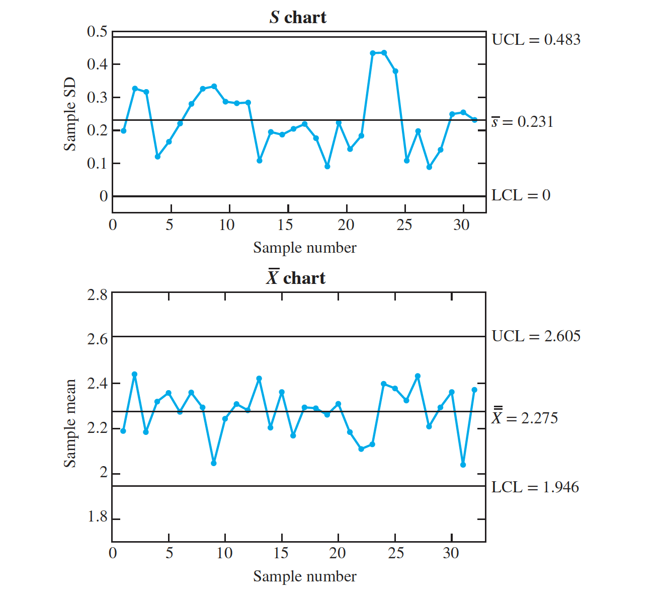
Once the variation is in control, we compute the X chart to assess the process mean.
In an $\overline X$ chart, the center line and the $3 \sigma$ upper and lower control limits are given by
$3𝜎 $upper limit = $A_3 \overline s$ Center line = $ \overline s$ $3\sigma$lower limit = $ A_3 \overline s$
The values $A_3$ depends on the sample size.
Which Is Better, the S Chart or the R Chart?
- It follows that the S chart is a better choice, especially for larger sample sizes (greater than 5 or so). The R chart is still widely used, largely through tradition.
- s is a more precise estimate of the process standard deviation than is R, because it has a smaller uncertainty
- To see this intuitively, note that the computation of s involves all the measurements in each sample, while the computation of R involves only two measurements (the largest and the smallest).
Control Charts for Attributes
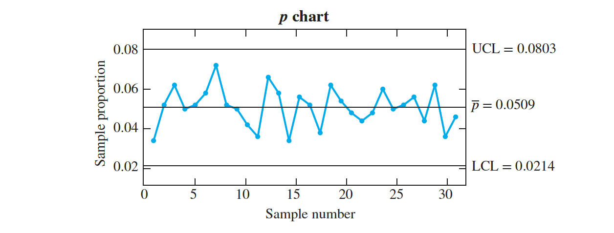
The p chart
Control Chart Performance
The $p$ chart is used when the quality characteristic being measured on each unit has only two possible values, usually “defective” and “not defective.” In each sample, the proportion of defectives is calculated; these sample proportions are then plotted.
Let $p$ be the probability that a given unit is defective.
If the process is in control, this probability is constant over time.
Let $k$ be the number of samples. We will assume that all samples are the same size, and we will denote this size by $n$.
Let $X_i$ be the number of defective units in the $i^{th}$ sample, and let $ \hat p_i = X_i∕n$ be the proportion of defective items in the $i^{th}$ sample.
Now $X_i ∼ Bin(n, p)$, and if $np > 10$, it is approximately true that $ \hat p_i ∼ N(p, p(1 − p)∕n)$. Since $ \hat p_i$ has mean $ \mu = p$ and standard deviation $ \sigma = \sqrt{ p(1 − p)∕n}$,
it follows that the center line should be at $p$, and the 3 control limits should be at $p \pm 3 \sqrt { p(1 − p)∕n}$. Usually $ \overline p$ is not known and is estimated with $p = \Sigma^k_{i =1}\hat p_i∕k$, the average of the sample proportions $ \hat p_i$.
In a $p$ chart, where the number of items in each sample is $n$, the center line and
the $3 \sigma$ upper and lower control limits are given by
$3 \sigma $ upper limit = $ \overline p + 3 \sqrt { \overline p(1 − \overline p)/n}$ Center line = $\overline p$ $3\sigma$ lower limit = $\overline p − 3 \sqrt {\overline p(1 − \overline )/n}$
These control limits will be valid if $np > 10$.
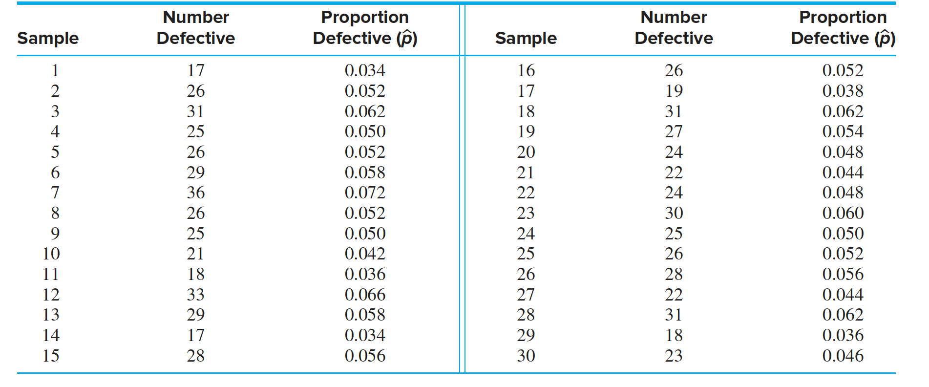
In the production of silicon wafers, $30$ lots of size $500$ are sampled, and the proportion of defective wafers is calculated for each sample. Table presents the results. Compute the center line and $3 \sigma$ control limits for the $p$ chart. Plot the chart. Does the process appear to be in control?
Interpreting Out-of-Control Signals in Attribute Charts
- When an attribute control chart is used to monitor the frequency of defective units, a point plotting above the upper control limit requires quite a different response than a point plotting below the lower control limit.
- Both conditions indicate that a special cause has changed the proportion of defective units.
- A point plotting above the upper control limit indicates that the proportion of defective units has increased, so action must be taken to identify and remove the special cause.
- A point plotting below the lower control limit, however, indicates that the special cause has decreased the proportion of defective units.
- The special cause still needs to be identified, but in this case, action should be taken to make it continue, so that the proportion of defective items can be decreased permanently.
The c chart
The $c$ chart is used when the quality measurement is a count of the number of defects, or flaws, in a given unit.
A unit may be a single item, or it may be a group of items large enough so that the expected number of flaws is sufficiently large.
Use of the $c$ chart requires that the number of defects follow a Poisson distribution
Assume that $k$ units are sampled, and let $c_i$ denote the total number of defects in the $i^{th}$ unit. Let $\lambda$ denote the mean total number of flaws per unit. Then $c_i ∼ Poisson(\lambda)$. If the process is in control, the value of 𝜆 is constant over time. Now if $\lambda$ is reasonably large, say $\lambda > 10$, then
$c_i ∼ N(\lambda, \lambda)$, approximately. Note that the value of $\lambda$ can in principle be made large enough by choosing a sufficiently large number of items per unit.
The c chartis constructed by plotting the values $c_i$. Since $c_i$ has mean $\lambda$ and standard deviation equalton $ \sqrt \lambda$, the center line should be plotted at $\lambda$ and the $3\sigma$ control limits should be plotted at $𝜆 \pm 3√𝜆$.
Usually the value of $𝜆$ is unknown and has to be estimated from the data.The appropriate estimate is $c =Σ^k_{i =1} c_i∕k$, the average number of defects per unit.
In a $c$ chart, the center line and the $3\sigma$ upper and lower control limits are given by
$3\sigma$ upper limit = $c + 3 \sqrt{ c}$ Center line = $c$ 3𝜎 lower limit = $c − 3 \sqrt{ c}$
These control limits will be valid if $c > 10$.

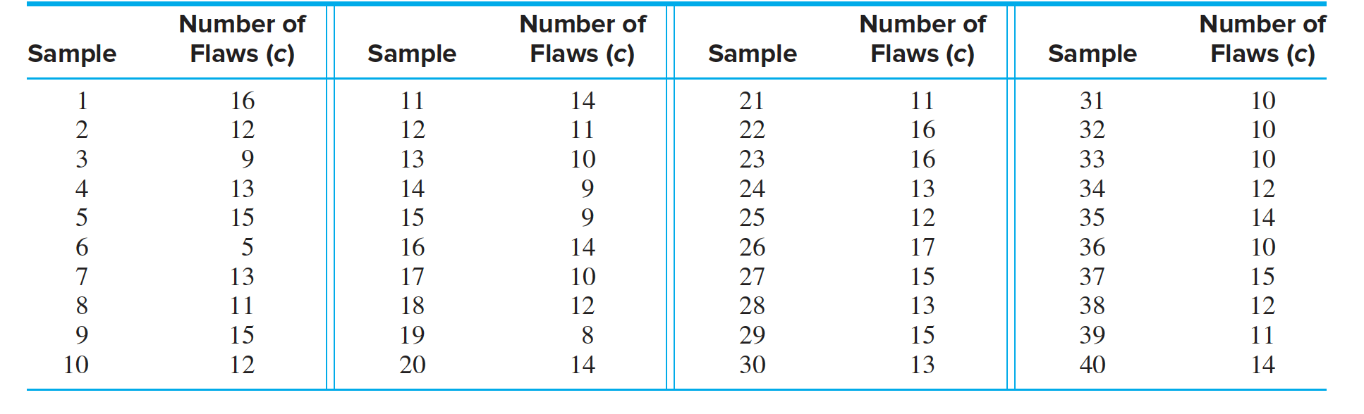
- Rolls of sheet aluminum, used to manufacture cans, are examined for surface flaws. Table presents the numbers of flaws in $40$ samples of $100$ $m^2$ each. Compute the center line and $3 \sigma $ control limits for the $c$ chart. Plot the chart. Does the process appear to be in control?’
The CUSUM Chart
- The Western Electric rules provide one method for reducing the ARL CUSUM charts provide another.
- Imagine that a process mean shifts upward slightly. There will then be a tendency for points to plot above the center line.
- If we add the deviations from the center line as we go along, and plot the cumulative sums, the points will drift upward and will exceed a control limit much sooner than they would in an $ \overline X$ chart.
- We assume that we have $m$ samples of size $n$, with sample means $X_1,\ldots , X_m$
- To begin, a target value $\mu$ must be specified for the process mean.
- Often $\mu$ is taken to be the value $\overline { \overline X}$. Then an estimate of $\sigma_X$, the standard deviation of the sample means, is needed. This can be obtained either with sample ranges, using the estimate $ \sigma_X ≈ A_2 \overline R∕3$, or with sample standard deviations, using the estimate $ \sigma_X ≈ A_3 \overline s∕3$.

In a $CUSUM$ chart, two cumulative sums, $SH$ and $SL$, are plotted.
For each sample, the quantity $X_i − \mu $ is the deviation from the target value.We define
two cumulative sums, $SH$ and $SL$.
The initial values are $SH_0 = SL_0 = 0$. For i ≥ 1,
$SH_{i} = max[0, \overline{X_i} − \mu − k \sigma_\overline{X_i} + SH_{i−1}]$ $SL_{i} = min[0, \overline{X_i} − \mu + k \sigma_\overline{X_i} + SL_{i−1}]$
The constants $k$ and $h$ must be specified. Good results are often obtained for the
values $k = 0.5$ and $h = 4 ~ or ~ 5$.
If for any $i$, $SH_i > h \sigma_\overline{X}$ or $SL_i < −h \sigma_\overline{X}$, the process is judged to be out of control.
Figure presents a CUSUM chart for the data in Figure 10.9. The values $k = 0.5$ and $h = 4$ were used. The value $2.952$ is the quantity $h \sigma_X = 4(0.738)$.
The CUSUM chart indicates an out-of-control condition on the tenth sample.
For these data, the CUSUM chart performs about as well as the Western Electric rules, which determined that the process was out of control at the eighth sample.
Process Capability
- Once a process is in a state of statistical control, it is important to evaluate its ability to produce output that conforms to design specifications. We consider variables data, and we assume that the quality characteristic of interest follows a normal distribution.
- Estimate the process mean and standard deviation. These estimates are denoted $\hat 𝜇$ and $\hat \sigma$
- If a quality characteristic from a process in a state of control is normally distributed, then the process mean $ \hat{\mu}$ and standard deviation $ \hat{\sigma}$ can be estimated from control chart data as follows:
$\hat {𝜇} = \overline X$ $ \hat {\sigma} = \frac {R} {d_2} $ or. $ \hat {\sigma} = \frac{s}{c_4}$ The values of $d_2$ and $c_4$ depend on the sample size.
- Note that the process standard deviation $\sigma$ is not the same quantity that is used to compute the 3$\sigma$ control limits on the $\overline X$ chart.
- The control limits are $𝜇 \pm 3\sigma_ \overline X$, where $\sigma_{\overline X}$ is the standard deviation of the sample mean.
- The process standard deviation 𝜎 is the standard deviation of the quality characteristic of individual units.
- They are related by $𝜎_{\overline X} = \sigma∕\sqrt n$, where n is the sample size.
- To be fit for use, a quality characteristic must fall between a lower specification limit (LSL) and an upper specification limit (USL)
- The specification limits are determined by design requirements.

Two indices of process capability, $C_{pk}$ and $C_{p}$
- The index $C_{pk}$ describes the capability of the process as it is, while $C_p$ describes the potential capability of the process.
$C_{pk}$ is equal either to $ \frac { \hat{\mu}− LSL}{3̂𝜎} $ or $ \frac {USL −\hat{\mu}}{ 3̂𝜎} $ whichever is less.
- The minimum acceptable value for Cpk is 1. That is, a process is considered to be minimally capable if the process mean is three standard deviations from the nearest specification limit. A Cpk value of 1.33, indicating that the process mean is four standard deviations from the nearest specification limit, is generally considered good.
$ C_{p} = \frac {USL − LSL}{6 \hat{\sigma}}$
- The design specifications for a piston rod used in an automatic transmission call for the rod length to be between $71.4$ and $72.8$ mm. The process is monitored with an $ \overline X$ chart and an $S$ chart, using samples of size $n = 5$. These show the process to be in control. The values of $X$ and $s$ are $X = 71.8$ mm and $s = 0.20$ mm. Compute the value of $C_{pk}$. Is the process capability acceptable?
Six-Sigma Quality
A process has six-sigma quality if the difference $USL − LSL$ is at least $12\sigma$
One-Sided Tolerances
$ C_{pl} = \frac {\hat \mu − LSL}{ 3\hat{\sigma}}$
$ C_{pu} = \frac {USL − \hat \mu}{3 \hat{\sigma}}$